Your customer paid. They smiled. They took the bag.
And then… they forgot about you.
That’s what happens when your packaging does nothing. When it’s just a bag. Functional, forgettable, gone. But here’s the thing – the brands that people actually remember? Their packaging works after the sale. It travels. It gets photographed. It sits on a table at a café while someone waits for their coffee. It’s seen by people who weren’t even in your store.
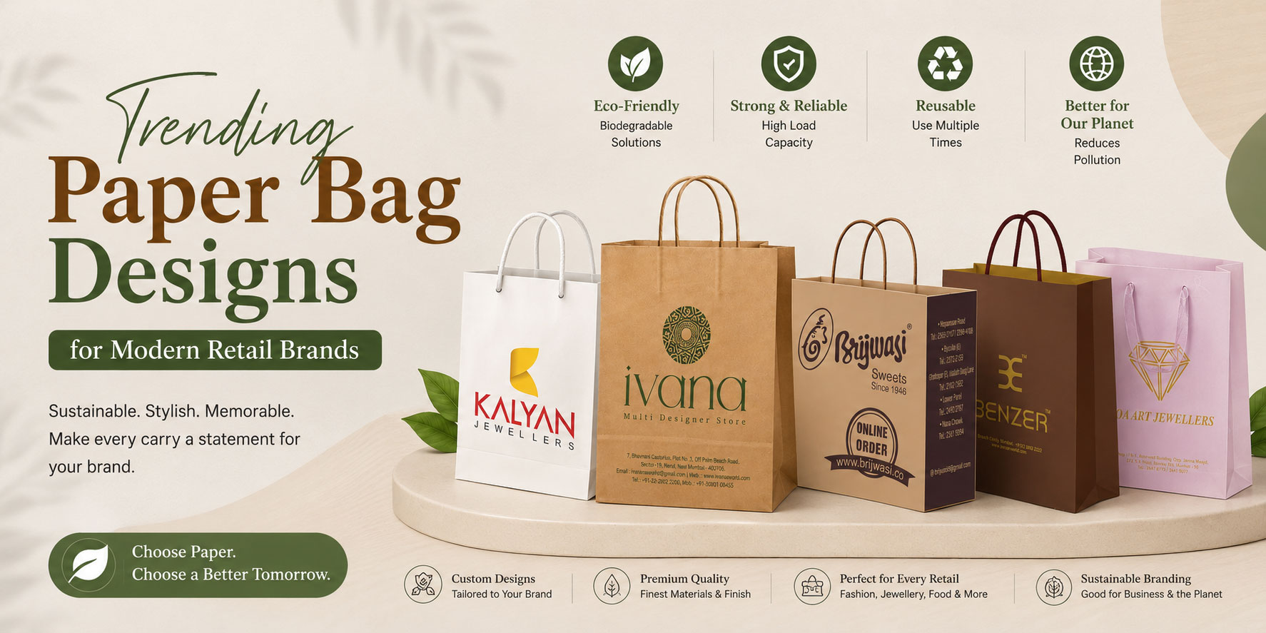
Paper bags, when designed well, do exactly that. And right now, there’s a very clear set of design directions that modern retail brands are leaning into. Here’s what’s trending — and more importantly, why each direction works.
Kraft Brown Is Having a Moment – Again
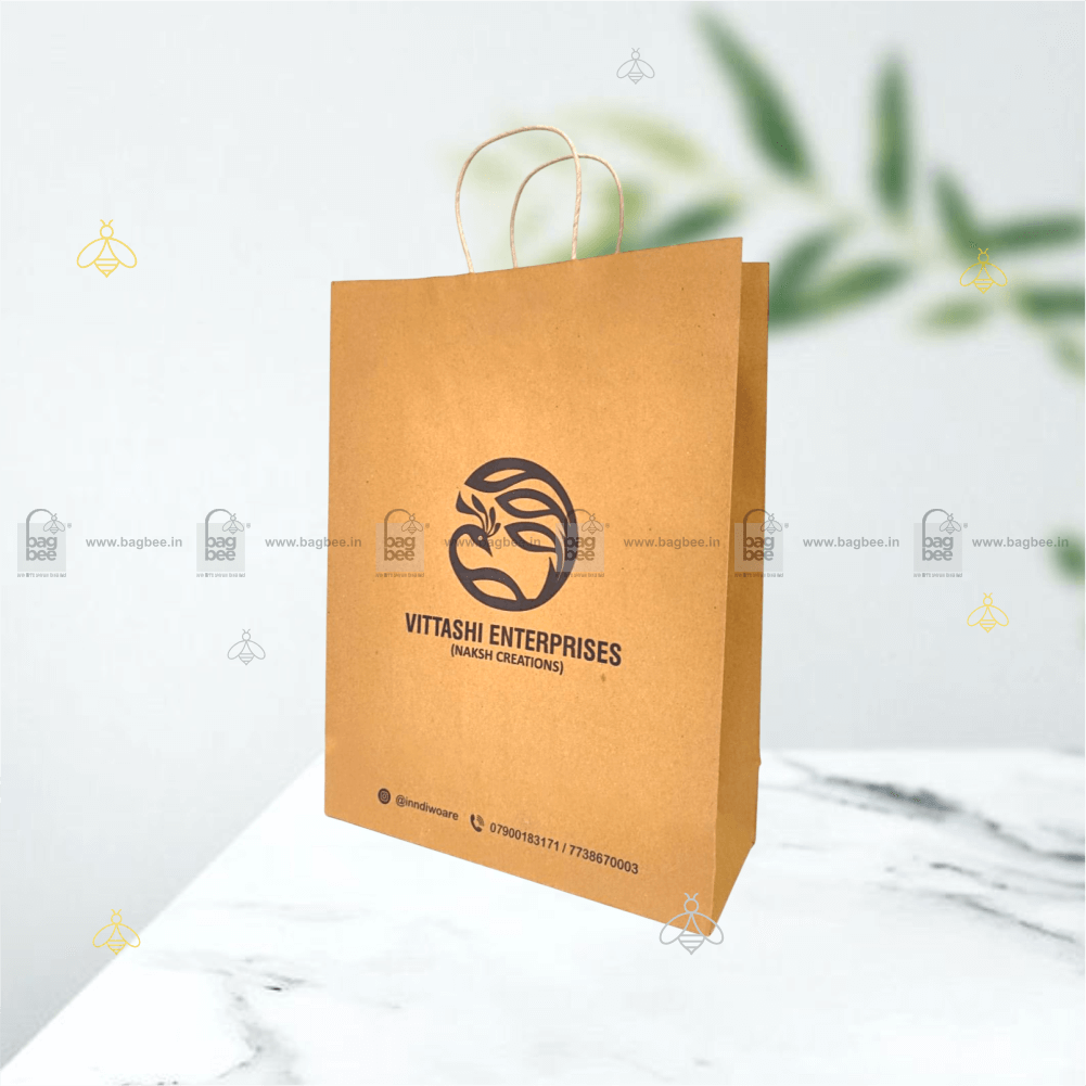
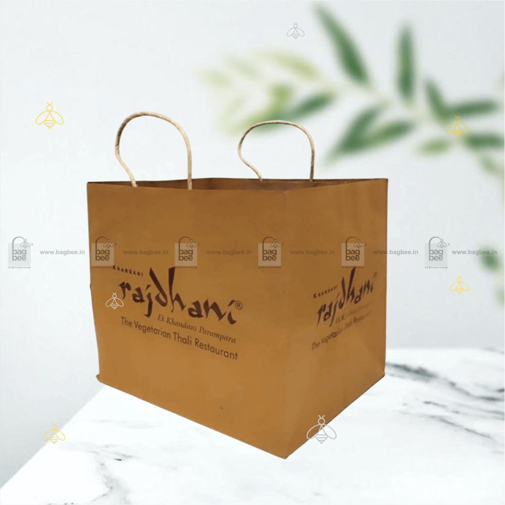
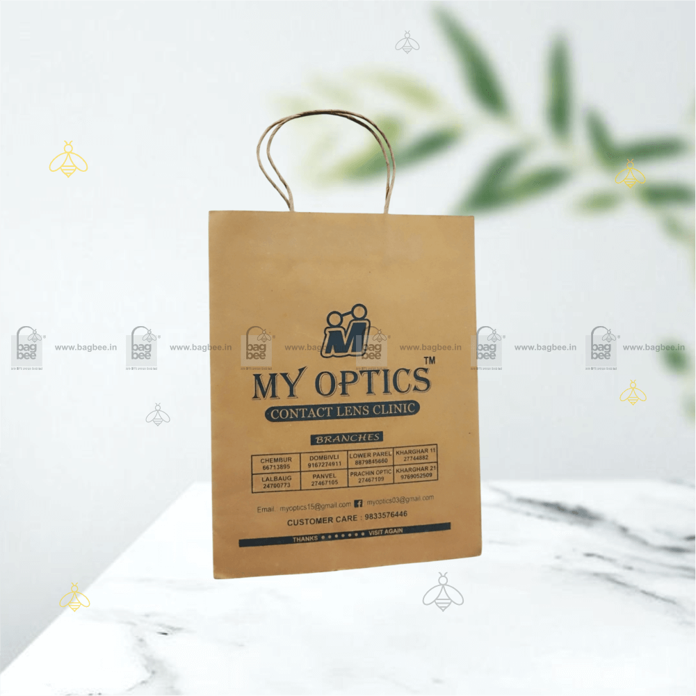
Natural kraft brown paper bags have been around forever. But what’s changed is how they’re being used.
The bare kraft look – uncoated, unbleached, with minimal print — has become a deliberate design choice for brands that want to communicate honesty. No pretence. No over-design. Just the material, a clean logo stamp, and maybe a single colour accent.
It works particularly well for organic grocery, artisan food, handmade products, and wellness brands. The aesthetic does the positioning for you. A plain kraft bag with a well-set logo in black or deep green tells a story about the product inside before the customer has even opened it.
The key is restraint. The brands getting this right aren’t printing less because they can’t afford more. They’re printing less on purpose. That’s a very different thing.
Matte Lamination – Understated, But Unmistakable.
Walk into any premium retail store – apparel, cosmetics, jewellery and you’ll notice the bags have a certain feel to them. Smooth. Almost velvety. No shine.
That’s matte lamination.
A thin laminate layer applied over the printed surface gives paper bags a soft-touch finish that feels genuinely premium in the hand. It reduces glare, deepens colour saturation, and gives the bag a visual weight that glossy alternatives simply don’t match.
From a practical standpoint, matte lamination also adds a degree of moisture resistance and surface durability which matters for bags that are meant to be kept and reused rather than discarded. For mid-to-premium retail brands, this is typically one of the most cost-effective upgrades available per unit.
Spot UV and Embossed Logos – Texture as a Brand Signal.
This one is worth understanding properly.
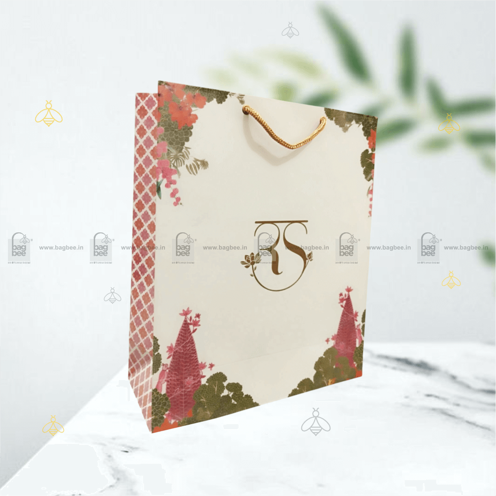
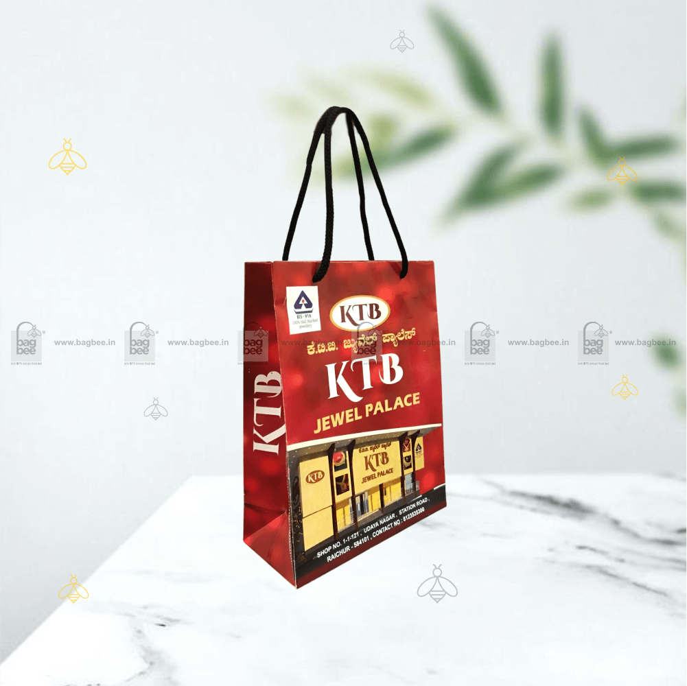
Spot UV is a printing technique where a glossy, raised coating is applied to specific areas of a matte surface – usually the logo or a key design element. The contrast between the soft matte background and the high-gloss logo creates a visual and tactile effect that’s immediately noticeable.
Embossing takes a similar approach through structure rather than coating — pressing the logo or pattern into the paper surface to create a raised, three-dimensional impression.
Both techniques are used by premium brands to make packaging feel considered and intentional. They cost more per unit than standard print. But for brands where the unboxing or purchase experience is part of the product: jewellery, premium gifting, high-end apparel — that additional cost is generally well-justified.
The customer touches the bag. They feel the logo. That’s a sensory brand interaction that flat printing simply cannot replicate.
Bold Typography – Less Illustration, More Statement.
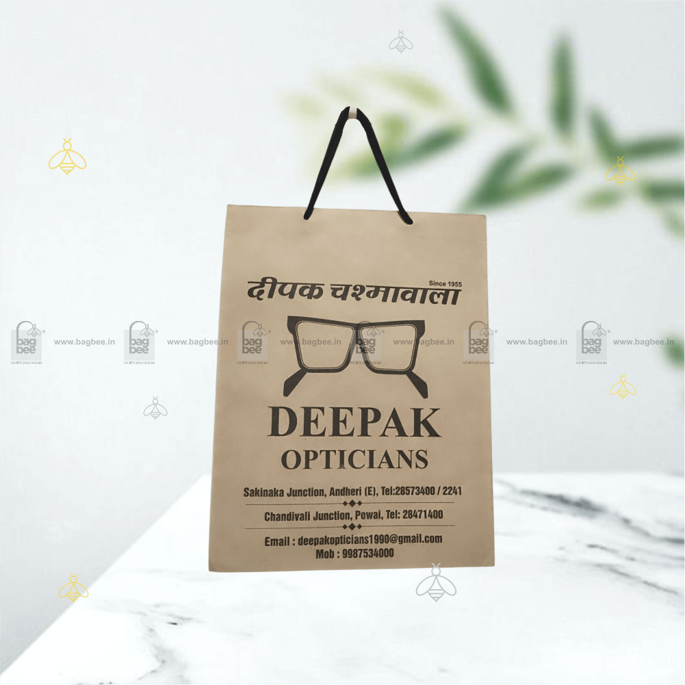
One of the cleaner design trends across retail packaging right now is the shift toward typographic-led designs. Large, confident letterforms. A single statement. A brand name set in an oversized typeface that owns the entire face of the bag.
No busy illustrations. No cluttered colour palettes. Just type — well-chosen, well-spaced, well-printed.
This direction works because it scales. A typographic design looks equally strong on a small boutique bag and a large retail carry bag. It photographs cleanly on social media. And it ages better than trend-driven illustrative work that can feel dated within a season or two.
For brands that are still building identity… bold typography is often a smarter first investment than complex artwork.
Two-Tone Colour Blocking – Simple & Striking.
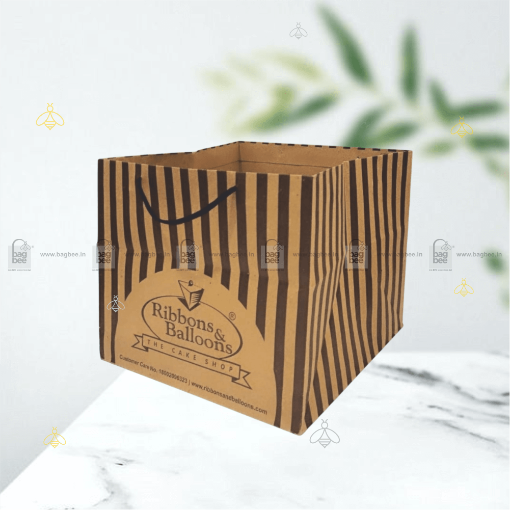
Colour blocking – using two distinct, contrasting colours divided by a clean horizontal or diagonal line – has moved from fashion into packaging in a noticeable way.
A deep navy bottom half with an off-white top. Forest green meeting warm cream at a diagonal. The geometry is simple, but the visual impact is strong. It gives a bag shelf presence and distinctiveness without requiring complex print setups.
For retail brands that want to stand out without overcomplicating their packaging brief… two-tone colour blocking is one of the more reliable design moves available right now.
Personalisation and Short-Run Custom Print
This deserves a mention because it’s becoming increasingly accessible.
Smaller brands and independent retailers no longer need to commit to enormous minimum order quantities to get custom-printed paper bags. Short-run printing has improved considerably, and the quality gap between small and large runs has narrowed.
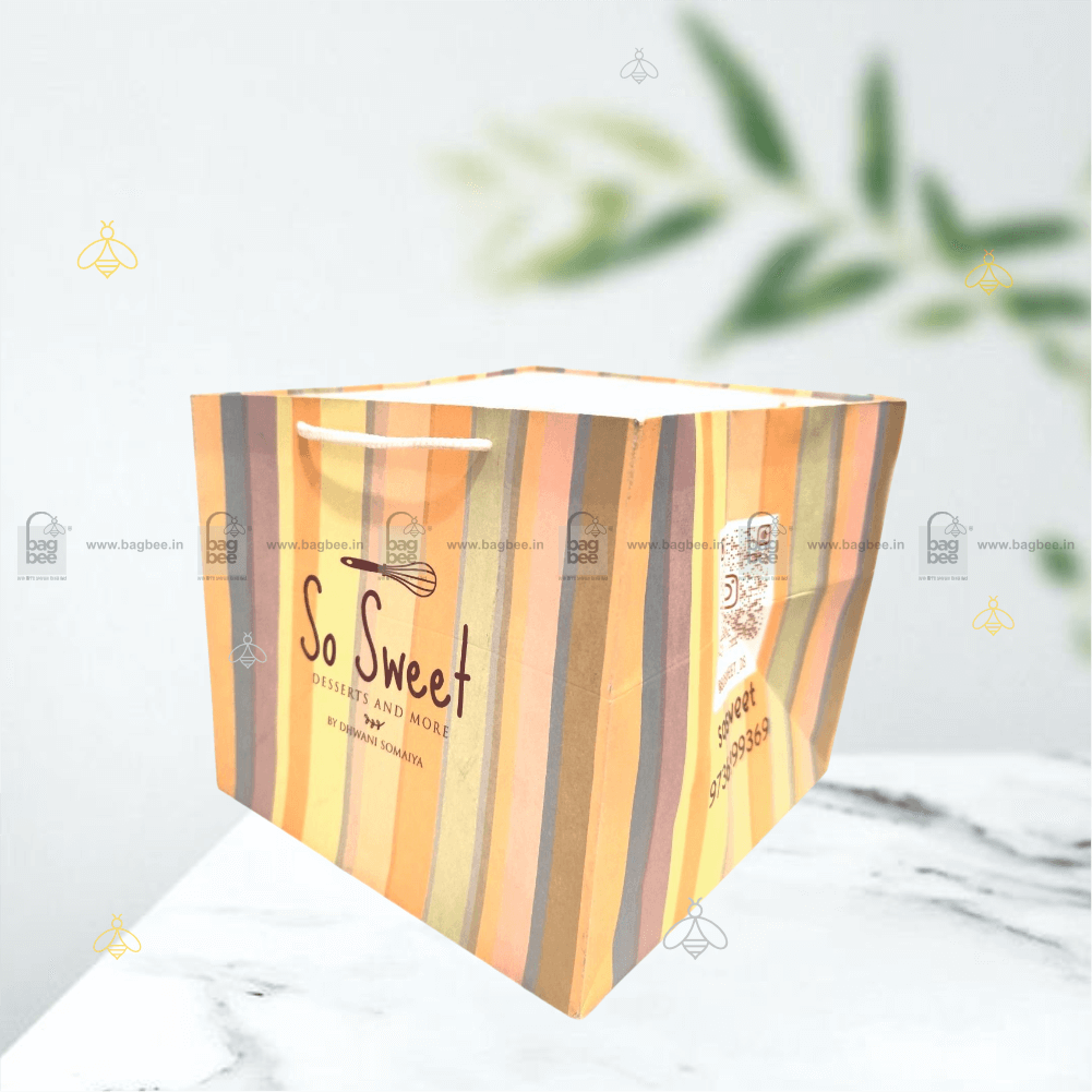
Custom bags with a brand name, a seasonal message, or a QR code linking to a product page are now within reach for businesses that might have assumed custom print was only for large retailers. This matters because personalisation, even at a simple level, changes how customers perceive a brand.
A bag with your name on it is not the same as a generic bag. It never was.
The Bottom Line
Paper bag design isn’t decoration. It’s positioning.
The brands investing in considered packaging — in texture, typography, finish, and restraint — are the ones whose bags end up being kept, photographed, and noticed. That’s not an accident. It’s a deliberate choice made at the point of ordering.
Your bag leaves your store with every customer. Make sure it’s working for you when it does.
Bag Bee manufactures custom-printed paper bags in Mumbai & Thane for retail, gifting, apparel, and food brands. Get in touch for design options, samples, and bulk pricing.